

At KickUp, we’re committed to listening and responding to what matters most to our customers. That’s why we’ve created the Customer Love Sprint — a dedicated process for focusing on the small but powerful improvements that make a big difference in your experience with KickUp.
Every Customer Love Sprint allows us to focus on implementing customer-driven changes and fine-tuning features. Below, you’ll find an overview of some of the enhancements we made, directly based on feedback we’ve received. Thank you for helping us shape a better KickUp!

Why: Districts often brand their events with logos, badges, and flyers that represent key initiatives, departments, and cohorts. Until now, there was no easy way to visually differentiate events or embed these branding elements directly in KickUp Learning.
Update: You can now embed images directly into the rich text editor for event descriptions in KickUp Learning, making it easier to visually organize events and reinforce district branding for ongoing learning experiences.

Why: Facilitators often prep for professional learning sessions by reviewing who’s attending—grouping participants by school, grade level, department, or other factors. But until now, that required switching between systems or manual lookups to locate information about registrants.
Update: Once configured by district administrators, event hosts can choose which staff attributes (like school, grade level, or department) appear directly in the Attendance tab. Just select the fields you want to see using the column dropdown—labeled with your district’s own terminology—and get the context you need to plan effectively.

Why: Some districts don’t use KickUp’s Out-of-District request process, but staff still see it on the platform, which can cause confusion.
Update: Districts can now disable Out-of-District requests entirely. This provides a cleaner, more relevant experience for staff navigating their “Your Log” page in KickUp.

Why: Educators and district leaders reviewing multi-year transcripts want a clear picture of total professional learning completed. Previously, transcripts only displayed credits and hours year by year, making it difficult to get a full summary at a glance.
Update: When a transcript includes multiple years of activity, a cumulative total of hours and credits now appears at the bottom. This gives you and your staff an easy-to-access total for relicensure or other documentation purposes.

Why: For admins managing event approvals, reviewing submissions one by one is time-consuming—especially when there are hundreds in the queue.
Update: You can now approve multiple submitted events at once with bulk approval. This saves hours of administrative time and helps make professional learning offerings available to staff faster.

Why: Admins want to ensure consistent and meaningful categorization of professional learning events. While tags are useful for reporting and organization, they’re only effective when used consistently. By making certain tag types required, admins can enforce their use and ensure that all events include critical metadata before being published.
Update: Users with "Manage events" permission can now designate tag types as required. Required tag types will be clearly labeled on all learning opportunity forms (including out-of-district requests) and will appear first in the list of tag types.
“Notes” field for attendance details

Why: Event facilitators often have important context about individual attendees—like if someone is arriving late, leaving early, or has a unique need. Until now, there wasn’t a clear place to keep those details within KickUp.
Update: You and your facilitators can now add "Notes" about each individual registrant for a learning opportunity. Facilitators and admins can use these notes to track relevant details and ensure sessions run smoothly. Notes are viewable by users with "View attendance" permission and editable by those with "Manage attendance" permission—helping teams stay aligned and responsive to staff needs.
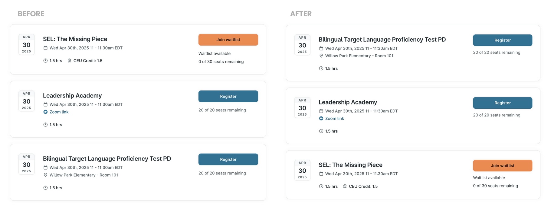
Why: When multiple events are scheduled for the same time—whether during large PD days or other high-volume times—it can be difficult for staff to browse sessions when they appear in the order they were created. Sorting these events alphabetically makes it easier for users to scan and select the right session.
Update: Events scheduled for the same time will now appear in alphabetical order rather than by creation date. This change improves the browsing experience for all users and simplifies planning for admins managing collections of concurrent events.

Why: Facilitators and users with elevated permissions often need to track the sessions they’re leading or supporting, but they currently don’t see the “Add to Calendar” button unless they register for the event. This creates unnecessary friction for users who are actively involved in PD delivery but not attending as participants.
Update: Users with event permissions (like view/edit/manage attendance) will now see the “Add to Calendar” button for events they have access to—regardless of registration status—making it easier to keep track of trainings in their calendars.

Why: As more departments use KickUp Learning to manage professional development, users need quicker and more relevant ways to access and organize data. Without the right filters, it can be time-consuming to track credit types across departments, navigate a growing list of collections, or find records that aren’t tied to a specific year.
Update: We’ve made several improvements to help streamline workflows and make tables across KickUp Learning easier to use:

Why: When someone commented on an Out-of-District request, the comment previously wasn’t included in the email notification—causing confusion for recipients. Without seeing the comment in the email, it was unclear what action was needed or why the notification was sent.
Update: Now, the full comment appears directly in the email notification when a comment is added to an Out-of-District request. This makes it easier for recipients to understand the context and respond quickly.

Why: Last customer love sprint, we made it possible to import Leads and their corresponding coaches or mentors in Coaching instances. But delineation of Leads and their Observers still has to happen one by one in Walks.
Update: Now, you can import Leads and their corresponding observers in Walks - expanding the time saving benefit of faster rostering.

Why: Coaches often begin working with educators before they open a cycle in KickUp, leading to inaccurate timelines. Until now, they couldn’t update the cycle’s start date—causing data inaccuracies and confusion.
Update: You and your coaches can now backdate the start of a coaching cycle to reflect when the work actually began. Just click the cycle start date to open the date picker, select the accurate date, and it will update instantly. This small fix makes coaching records more accurate and aligned with your real work.

Why: When leads or supervisors log into KickUp Growth, they currently land on the “All Rosters” view by default—even if they don’t have permission to interact with all the staff listed. This can create confusion and unnecessary clicks, especially for principals who just want to view and act on their assigned staff. It also slows down the workflow for evaluators who need to take quick action.
Update: Now, users with lead or supervisor roles who don’t have “Manage” permissions will automatically land on the “My Roster” view—showing only the staff they’re assigned to evaluate. This reduces confusion and gets evaluators to the right place faster. Admins and users with “Manage” permissions will still default to “All Rosters,” and all other role-based behaviors remain unchanged.

Why: Many district leaders review observation and walkthrough data on a weekly—or even daily—basis, often needing to share it across multiple systems or dashboards. Until now, that meant relying on manual exports or reaching out to a CSM.
Update: You can now set up automated exports of form data (like coaching logs, walkthroughs, evaluations, or PD feedback) on a regular cadence—nightly or customized to your needs. This makes it easier to track progress, report out to stakeholders, or feed your own external reporting tools without lifting a finger.
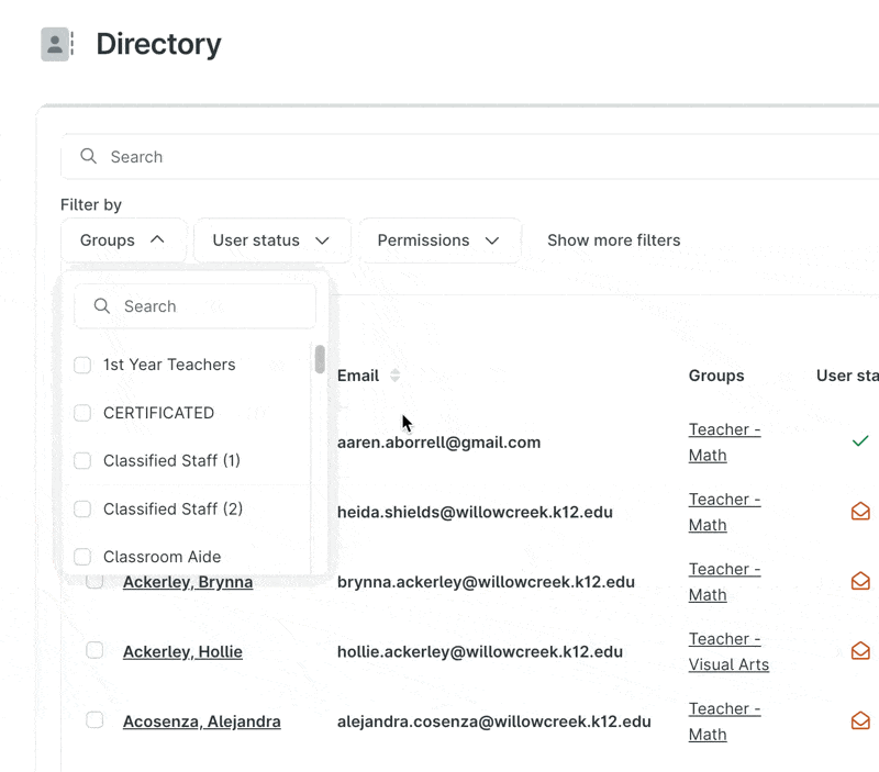
Why: When filtering in the Directory, users currently have to scroll through long lists of values in filters like Groups or Attributes, which can be time-consuming—especially for districts that update these regularly or have many options. This slows down basic tasks like grouping, exporting, or reviewing user information. Since a searchable dropdown already exists in other parts of the platform, like the Opportunities table, this is also a request for interface consistency.
Update: You can now search within Group and Attribute filter dropdowns in the Directory. This update saves time, reduces frustration, and brings the Directory experience in line with other parts of the product.
Toggle between Top % and Average in Matrix question

Why: When analyzing responses to a matrix question, it's often helpful to view the data both as a Top % (how many respondents selected the highest categories) and as an Average (overall movement across the scale). While this toggle exists in in-context data and custom reports, it wasn’t available in Dashboards—making it harder to get a nuanced view of progress. Users had to duplicate blocks to show both perspectives side by side, which took extra time and cluttered the dashboard.
Update: Now, in matrix question blocks on Dashboards, users can toggle between Top % and Average views—just like in reports. This provides more flexibility and helps you capture both overall shifts and progress into top performance categories, without duplicating blocks.

Why: Users need to see who the creator or owner of a specific Dashboard is. This would allow users to know who to communicate with for any questions or requests to update the Dashboard. Without this, users may struggle to identify the right point of contact, especially when there are many dashboards in use. This is particularly important when stakeholders need to collaborate or follow up on the data reflected in a dashboard.
Update: Now, the creator’s name will appear under the Dashboard title, allowing users to easily identify who built the dashboard. And, on the table of all dashboards, a new column will be added to show the creator’s name.

Why: Forms and modals are key parts of the user experience, and they need to be readable and usable across devices. On smaller screens, form answers can appear squished, submission views are difficult to scan in narrow windows, and modal padding makes it hard to focus on content. These issues are especially noticeable on mobile devices.
Update: We’ve made a few improvements to the mobile viewing experience: Form answers now display full width on mobile, form submissions open in a full-screen view to improve readability, and modals now take up the full screen at mobile breakpoints to avoid squished content.

Why: Districts using the same feedback form across multiple years have struggled with applying date ranges that don't always reflect the year of the event itself. This leads to confusion when analyzing feedback submitted for events that occurred in previous school years.
Update: You can now filter Professional Development (PD) feedback data by the specific school year in which the event took place, not just by date range. This update ensures that you can accurately analyze feedback based on when the event occurred—whether it’s for the current year or past years—allowing for better organization and insights into PD activities across multiple years.

Why: Users want the ability to personalize their KickUp homepage by adding their district or organization’s logo. This would make the product feel more integrated into their existing set of tools, fostering a stronger sense of ownership and connection to the platform.
Update: You can now personalize your KickUp homepage by uploading your district or organization’s logo. It’s a small change that helps staff instantly recognize the platform as part of your district’s toolkit—not just another tab.
Schedule a demo with one of our friendly team members.


.svg)

